Vintage T-Shirt Design With AI: Prompt and Print Guide
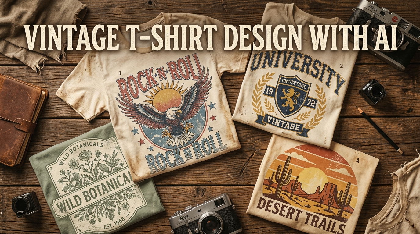
To make a convincing vintage t-shirt design with AI, pick one real period, describe its visual language precisely, and treat the generated image as a draft. Fix the lettering yourself, add controlled wear, check the artwork against your printer's template, and sample the shirt.
“Make it retro” is not enough. A 1970s surf souvenir, a 1980s skate graphic, and a 1990s grunge tee are different design systems. Mixing them at random usually produces the visual equivalent of a costume.
Start With an Era, Not a Vintage Filter
Before opening a generator, write a one-line art direction:
A fictional 1970s coastal repair-shop badge, made for a faded navy shirt.
That sentence gives you a period, a subject, a composition, and a garment colour. Now collect references for structure rather than copying one design. Look at period packaging, catalogues, matchbooks, travel patches, record sleeves, and local advertising. Note repeated choices:
- Is the composition a circle, arch, rectangle, or loose illustration?
- Are the letters condensed, rounded, collegiate, hand-painted, or serif?
- Does the era use flat spot colours, an airbrushed gradient, or engraved lines?
- Is wear coarse and patchy, or fine and speckled?
- Which parts must remain readable from several feet away?
The aim is to understand a visual grammar. Do not ask the model to imitate a living artist, reproduce a band tee, or rebuild a recognisable logo.
Use This Vintage AI Prompt Formula
A useful prompt has seven parts:
| Part | What to specify | Example |
|---|---|---|
| Subject | An original, concrete idea | desert roadrunner carrying a canteen |
| Period | A decade and relevant subculture | 1970s Western roadside souvenir |
| Composition | The arrangement on the shirt | centred oval badge with an empty upper arch |
| Typography area | Where type will go, not final AI text | clean headline space above the illustration |
| Palette | Three to five printable colours | faded turquoise, rust, cream, dark brown |
| Texture | One controlled print effect | coarse halftone and sparse ink wear |
| Constraints | What the asset should exclude | isolated apparel graphic, no shirt, no photo, no logo |
Put together, it reads:
Original desert roadrunner carrying a canteen, 1970s Western roadside souvenir illustration, centred oval badge, clean empty headline arch above, faded turquoise, rust, cream and dark brown, coarse halftone with sparse ink wear, bold screen-print shapes, isolated apparel graphic, no shirt mockup, no photograph, no brand logo.
“Transparent background” can help, but do not assume the result is genuinely transparent. Remove and inspect the background in your editor before export.
Six Original Prompts to Adapt
These prompts deliberately avoid real brands, teams, bands, characters, and slogans. Replace the subjects and colours with details that serve your own niche.
1. 1970s surf repair shop
Original pelican holding a wooden hand plane, fictional 1970s coastal board-repair shop emblem, circular composition, empty curved text space, faded coral, mustard, sea blue and cream, thick ink shapes, subtle sun-faded speckles, isolated t-shirt graphic, no existing brand, no mockup.
2. Fictional collegiate outdoors club
Original mountain goat and compass crest, fictional mid-century outdoors club patch, symmetrical shield, blank arched headline area and small lower date area, forest green, warm cream and brick red, sturdy varsity shapes, light edge wear, isolated print graphic, no university name, no real team marks.
3. Botanical field illustration
Original chanterelle mushroom cluster, nineteenth-century field-guide engraving adapted for a one-colour shirt print, centred vertical composition, bold cross-hatching with simplified fine detail, warm cream ink for a dark brown garment, small empty caption area, no paper background, no specimen label.
4. Western roadside souvenir
Original jackrabbit beside a desert motel sign with invented geometric symbols, 1960s roadside souvenir art, wide horizontal badge, rust, faded turquoise, sand and charcoal, rough stencil texture, large clean shapes, isolated apparel graphic, no real location or business, no mockup.
5. 1980s skate graphic
Original iguana on a homemade ramp, 1980s underground skate-zine energy, asymmetric diagonal composition, electric blue, hot pink, black and off-white, photocopied halftone and torn-edge shapes, strong silhouette, empty block for manually added title, no brand marks, no famous characters.
6. 1990s grunge nature tee
Original night moth over a crescent-shaped forest, early-1990s alternative nature graphic, oversized central illustration, muted violet, moss, charcoal and bone, dry-brush ink with restrained noise, readable silhouette, isolated design asset, no album reference, no artist imitation, no mockup.
Generate several compositions, not twenty tiny variations of one weak idea. Compare silhouette, focal point, colour separation, and whether the design still makes sense at thumbnail size.
Add the Lettering Yourself
AI image models are useful for exploring type placement, but they are unreliable typesetters. They can misspell a word convincingly enough to escape a quick glance. They also tend to mix letter styles or invent half-characters.
A cleaner workflow is:
- Ask for a blank banner, arch, or caption panel in the generated art.
- Remove any accidental pseudo-text.
- Add the actual wording in the editor.
- Confirm that the font licence permits merchandise use.
- Adjust tracking, line breaks, outline weight, and curve by hand.
- Read every word at 100% zoom and again on a mockup.
For a worn treatment, distress a copy of the finished lettering rather than asking the model to invent distressed words. Keep an undamaged working version in case the texture becomes too aggressive.
Distress the Print, Not the Whole Picture
The useful vintage effects are ordinary print behaviours: missing ink, coarse dots, rough stencil edges, and faded colour. Printful's vintage t-shirt guide recommends effects such as distressed overlays, speckles, retro filters, splatter, halftone, and stencil treatments. It also warns that ultra-faint or semi-transparent details may disappear or print unevenly with DTG.
Use texture with a reason:
- Coarse halftone: good for gradients and photocopied or comic-style shading.
- Sparse speckles: useful for sun fade without damaging the main silhouette.
- Dry-brush gaps: suit hand-painted signs and rough lettering.
- Stencil breaks: fit workwear, military-surplus, and shipping-mark aesthetics.
- Cracked ink: best on larger solid areas, used sparingly.
Do not lay the same grunge mask over every pixel. Faces, small lettering, eyes, and thin outlines need more protection than a broad background shape. Zoom out often. If the design only works when viewed close up, the shirt will not rescue it.
Match the Artwork to the Shirt and Print Method
The garment participates in the effect. Printful notes that cotton absorbs ink differently from heather blends and tri-blends, while blended or washed fabrics can contribute an already-aged appearance. A cream graphic on a heather brown shirt may need less artificial distressing than the same graphic on smooth black cotton.
DTG can produce a vintage result, but the digital file still needs shapes strong enough to survive printing. Screen printing is another option when the economics and colour count suit the run. Neither method makes a poorly prepared file authentic by magic.
Before committing to a product:
- preview the artwork on the exact garment colour;
- inspect small distress marks at full export size;
- check whether transparent areas are truly transparent;
- use the print provider's current file template and safe area;
- order a sample and view it in normal indoor and outdoor light.
Check Marketplace Rules and Intellectual Property
Vintage is an aesthetic, not permission to reuse old commercial art. Age alone does not prove that a logo, photograph, phrase, character, or recording artwork is free to use.
Etsy's Creativity Standards allow seller-prompted AI creations, and Etsy says AI use must be disclosed in the listing description. The seller still needs an original product that fits Etsy's standards.
Redbubble's User Agreement puts responsibility on the uploader to own or hold the necessary rights. Its IP and publicity-rights policy also makes clear that copyright, trademark, and publicity rights matter.
Practical rules:
- Do not put real band, team, university, company, or event names in prompts.
- Avoid “in the style of” instructions aimed at a specific living artist.
- Do not trace a marketplace bestseller or copy its distinctive layout.
- Search proposed names and phrases before investing in a collection.
- Keep prompt notes, working files, font licences, and source records.
- Review the current marketplace policy again when you publish; platform rules change.
This is a production checklist, not legal advice. If a design depends on a recognisable mark, personality, or franchise, get qualified guidance before selling it.
Prepare the Vintage T-Shirt Design for Print
MerchBanao's vintage design tool can help generate the first artwork direction. In the editor, remove the background, recompose the art, add controlled type, preview it on a mockup, and export a 4200 × 4800 PNG.
That export size is not a universal marketplace rule. Open the exact template for the product you plan to sell, then resize or rebuild the composition if its required dimensions or aspect ratio differ. The print-ready t-shirt design guide explains the pixel and DPI relationship in more detail.
Run this final check:
- The subject and wording are original.
- Every word is correctly spelled and manually typeset.
- The palette works on the chosen garment.
- Thin lines and distressed gaps survive at print size.
- No stray background pixels remain.
- The file matches the provider's current template.
- The listing discloses AI assistance where required.
- A physical sample has been reviewed.
If the generated background is difficult to clean, use the t-shirt background remover and inspect the edges on both a light and dark canvas.
Make the Design Feel Found, Not Fake
The strongest vintage t-shirt design with AI starts with a believable premise: an imaginary repair shop, a made-up field club, or an original roadside attraction that could have existed in a particular place and decade. The AI supplies raw visual options. Your editing, typography, restraint, and print test supply the credibility.
Start with one prompt from this guide, generate a few distinct compositions in the AI t-shirt design generator, and take the best one through the full print checklist before building a collection.